
Objective: Transforming the anime and manga experience: crafting an intuitive, visually immersive UI/UX for seamless navigation and vibrant community engagement on our streaming and reading platform.
Constraints: Incorporating maximum utility, inclusivity, and functionality. Encompassing multiple opinions on what the platform should be like.
Tachiyomi is a platform that is meant to support the anime/manga community. It is an in-depth UI/UX project that serves to consolidate resources and elevate the user experience for users worldwide. Tachiyomi has been a passion project, a labor of love not just from me but on behalf of all my fellow otaku enthusiasts in the vibrant communities of Instagram and Discord.

Project Title
Add paragraph text. Click “Edit Text” to update the font, size and more. To change and reuse text themes, go to Site Styles.

Project Title
Add paragraph text. Click “Edit Text” to update the font, size and more. To change and reuse text themes, go to Site Styles.

Project Title
Add paragraph text. Click “Edit Text” to update the font, size and more. To change and reuse text themes, go to Site Styles.
INSPIRED?
Explore these:


_edited.png)
PHASE 1
DATA COLLECTION
PHASE 2
RESEARCH
PHASE 3
USER STUDY
PHASE 4
SYSTEM MAP
PHASE 5
PROTOTYPE
PHASE 6
UI AND TESTING
Phase 1
Data Collection
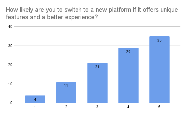
Research Methodology: Google Survey
Circulated on: Instagram, Discord Communities, WhatsApp, College Groups, and Twitter.
Objective: To comprehensively understand the gaps prevailing in the tools utilized by the anime/manga community.
This nuanced Google survey gave insight into the perspectives, concerns, and behaviors of stakeholders within the community. Through this survey I could observe the users’ behavior, needs, and reservations about existing platforms. Gaps were discovered in the existing platforms' interface and operational efficiency.


Phase 3
User Journey
The following 6 personas were created and analyzed in depth:
Alli- Artistic Otaku; 21; Anime+Manga Enthusiast
Chanakya- Leisure Weeber; 24; Casual Viewer
Maya- Parental Guide; 32; Versatile User
Alex- Techy Teen; 17; Active Communicator
Sakura- Crossover Gamer; 25; Industry Worker
Kei- Manga Artist; 30; Passionate User
Identifying isolated issues is the first step, and then placing them into the practical process is the next.


Hover and click to magnify.
User Journey
Creating a journey that defines the steps within steps, and the factors involved in each allows us to pinpoint the screens that need to be focused on.
STAGES OF SERVICE
Creating a visual to represent the mood of the user gives us a realistic grasp of the major pain points, and the reasons the step is lacking.
TOUCHPOINTS
This user journey was an overlapped analysis of multiple user interviews as they stepped through the pre-existing manga and streaming platforms.
LIVED EXPERIENCE
Phase 4
System Maps &
Information Architecture
Tachiyomi revolutionizes user experience through its ingenious circular system, reflecting a deep understanding of user priorities. By employing this approach, Tachiyomi streamlines its user interface, simplifying choices and enhancing customization.
The circular system within the app identifies user priorities, allowing for intuitive navigation. Users are presented with a streamlined interface that minimizes complexity. Instead of overwhelming users with an array of options, Tachiyomi presents them with simpler, tailored choices. This thoughtful design encourages users to focus on their reading preferences without getting lost in a labyrinth of menus.

PROTOTYPE
To view high fidelity frames in Figma
click on any of the device screens!
To view process work
and design details,
scroll down!


Epilogue
Responsive
Layouts
I made significant use of the auto layout feature to create responsive designs and found that the adaptations between screens mixed with customizable layouts in terms of density and colors creates a tailored experience that will automatically enhances the experience of users with different requirements.
Laziness
Is Key
Yep- that’s it. Nobody likes to work a little extra. Seven clicks, remember a number, reset preferences, check for updates- no way. Once you realize that laziness is the universal problem for which design is meant to create solutions, the work process becomes crystal clear.
Stepping Into
Different Shoes
Many times while sketching out the wireframes, I was thinking about the importance of the flow of information, but when I laid it out on Figma, I kept coming back to place myself in the shoes of the user personas and tried to see it from their perspective- then made changes to the intial plans.